Search This Blog

Thursday 28 April 2011

Chris Bailey - Evaulation

In what ways does your media product use, develop or challenge forms and conventions of real media products?
Within our media productuct we have tried to include as many conventions of a thriller to make the narrative more beliable and make the audience and spectator enjoy the opening of the film more. In the opening we have kept dialogue to minimum with the sound building throughout which is building the tension. When deciding what to do for our thriller i looked on www.youtube.com at some thriller openings. Some of these were:

Jaws - http://www.youtube.com/watch?v=dT5-th18VR4
28 Days Later - http://www.youtube.com/watch?v=0JgiJo5VK0M


In most thrillers we see the opening of the film having and establishing shot. An establishing shot sets the scene  and shows what place the characters are in and also the surrounding of the characters. In my film (phone grid) i decided to use this technique as it helps set the scene and is quite disturbing to the audience as thhey are not sure what is going to happen. Another convention that we used in our thriller was choicing the correct sound needed to build after each shot. Using this technique it build the tension as the audience /spectator when watching are not sure what is going to happen.This keeps the spectators at the edge of their seats.

We also have a hidden identity which is used straight from the start  this means that the audience do not know who the pragmatist is. We have used phones ringing and therefore we do not hear the protagonist  or see the protagonist, so from the start there are no clues to who this might be. To produce this when editing i used discuntinty edditing, this is where the narrative is not in a simple order. During the opening we cut to the phone in the field then we cut to a character and back and forward.

Using technology as a key for issues raised in the film i hope that young people will want to go see it. In the news and in newspapers we hear and see a lot about the latest technology that has come out. Due to this i hope that people will be encouraged to what the film as it has many different themes and issues that are going on in today life about who technology has grown and how it can also be used in bad curcumstances.

How does your media product represent particular social groups?

We have tried to represent social groups in our film; we have used some stereotypes to help the audience understand what the character is like. This is effective, as we do not have to go into detail at the start of our film phone grid as we hope that the audience/spectator can understand the characters roles and what they are like, though the means of differnt sterotypes.

We have used tradional gender types; these include -

 Men – just coming out of the gym this is traditional as you only see a man in the shot and no women. However this can also link to a modern stereotype as men being vein and caring too much about themselves.-      

Women – In the kitchen making toast and also at home in bedroom looking into the mirror and caring about their image, both of these are traditional stereotypes of women.- 

   The couloirs we see also reflect what type of person the character is and what he/she is going to be like. We see the girl waking up out of bed wearing pink; this atomotacily links her to a girly girl.

What kind of media institution might distribute your media product and why?

 As our film is a low budget film as a group we have decided to try and get distribution from a company called 'Diffusion Pictures'. Diffusion pictures is a new company that was created in 2006, it also specializes in films such as ours that struggle to get a distribution deals. Here is a link to there website:   http://www.diffusionpictures.co.uk/

- We hope to get out our film out on the Internet before it goes onto television or even to the cinema. We are going to put our film on such websites such as; BBC shorts films and also virgin short films. We hope by doing this word of mouth will get around and make our film watched more.

.-    With many different social network sites that have been set up on the internet over the last few years such as; my space, Facebook and also twitter it is easy to spread our film around and get it known which would therefore lead to more people watching it, and boost up the hits on the film.  Facebook is also very good and the idea that we will use is make people watch the trailer and if they send it to 10 of their friends they can then watch the whole movie. This is a very clever way of advertsing as it will help spread the word quicker.

- This is a cheaper way of broadcasting our film, and easier to transport around as we will just have it on the internet to watch, rather than people transporting big cinematic roles of film to all different cinemas to audiences and spectators to watch. It saves money on fuel costs and also drivers. This link here tells you all about cinematic roles and how they have changed over the years
                             HOWEVER.

-       Some people ay not have the Internet to watch our film meaning that they wont get to see it. Also people may not have the correct/up to date flash player and may not want to download the new version as it takes to long and therefore they will not be able to watch our film.- 

-In cinemas we see a lot of advertising about new and ongoing films in the cinema, which are located outside and also inside to grab consumers attention to watch our film. As our film is on the Internet people will not get to hear about it meaning that adverting for our film is lacking which therefore links to not a lot of people watching it.


Who would be the audience for your media product? 

- To decided our film rating we have used the BBFC website. BBFC stands for the British board of film classification. The British Board of Film Classification is an independent, non-governmental body, which has classified cinema films since it was set up in 1912 and videos/ DVDs since the Video Recordings Act was passed in 1984 (Taken from BBFC website)

- On this website there is a lot of information to what your film should be classified as, and the reasons why it should be that. After long reasrch looking on this website we have decided to have a classification of 15.


No one younger than 15 may see a ‘15’ film in a cinema. No one younger than 15 may rent or buy a ‘15’ rated video work.After the opening of the film there are many different themes and issues that are brought up. There is the following in our film;

Imitable behavior – In “Phone Grid” we see elements of behavior however it is very unlikely that it will be copied by any spectators watching our film-   

Strong language – The strong language in our film “Phone Grid” is frequently used throughout, however it is only used due to the context within our film.

Violence – We have mild scene of violence in our film witch makes it very discreet, however we do not have gory images and according to the BBFC if we did it would unlikely to be acceptable for a 15.

 They are the reason why we have chosen a 15 for our film, this is a perfect age group to have your film in as many cinema consumers are aged between 15- 24 and they spend there leisure pound watching good films. Also as this is a 15 it fits in with social networking sites such as Facebook where a lot of students young males and females are on, this will be good when we start adversting on Facebook and getting other to do also. 


How did you attract/address your audience?


- To attract our audience we have done a number of different things. Our target audience is from 15 -21 year olds.  We have incorpatred many different themes and issues, which relate to teenagers and young adults.
-The actors that we have used in “Phone Grid” are at a similar age as our audience meaning that they have automatically got something in common with them which is very effective as it can helps engage and builds a relationship between the characters and the audience, which leads to people enjoying the film more.

-We have used the issue of technology from the opening of the film, by using this it is a big theme as it can attract people who are interested in different types of technology. The technology that we used was a mobile phone. Most people in our target audience (15-21) will own a mobile phone, this means that there will be another connection made with the film that the audience can make.
-When watching this film, you are not able to see who is the protagonist from the opening, this makes the narrative slightly confusing however it puts the audience at the edge of there seat, building suspense and building up spectator with the audiences.
-However when attracting as our certificate is a 15 it is limited, but on a positive side it can attract people as they know it isn’t going to be a family friendly film, where you would have children in the audience with their mums and dads, but it will have teenagers that like a strong narrative film with young adults themes and issues.

What have you learned about technologies from the process of constructing this process ?

- When filming i have learned that the white blance is very important as if it is incorrect it can make the footage of the filming look very bad. This photo to the left show this.

- Sound is very important when producing the final product. I forgot about sound till the last minuite and it was a bit of a rush to get the correct sound with all of the sound effects. Also with garage band i learned how to export/share it as a final movie into quicktime player witch i did not now how to before.

- When looking through the footage i thought that the handheld shorts were not as good as thoese when i used a tripod. I realised that when doing a handheld shot it needs to fit in with the narrative such as if somone is running it would be good to use a handheld rather than a tripod. However with most shots a think a tripod is more affective as it does not have the camera shake.

- The 180 degree rule i also learned as, when filming i had to refilm some parts as i had noticed that by mistake i had broken the invisable line. I learned how confusing it was to the audience when watching back as it looked like people in the frame kept on swapping positions backwardsand forwards.

Looking back at your preliminary task, what do you feel you have learnt in the progression from it to the final product?

As I wanted to have specialized titles in our film I decided to look at different programs to produce the titles apart from using final cut text as I thought it was quite plain and simple and the effect that I wanted the titles to be was not on there. The program that I found was called motion.

To learn to use this programe i looked on you tube and looked at tutorials about how to use it, here is one of many that i watched  http://www.youtube.com/watch?v=uVj7kpA_B_8

Here are some screen shots of what the progame looks like when you open it up
     

This is a graphics designer program and with this I managed to create the titles. This title that I used fits in with the themes and issues as they come up in a code format. I think that this is a main program that I have learned to use as in the future I will use this to make my titles to stand out and have an impact on the audience when watching the opening to the film.

http://www.youtube.com/watch?v=uVj7kpA_B_8

When filming the preliminary task we were only aloud to use the standard definition cameras, however in our final film we were aloud to use the Sony HD camera, this made a big difference. The camera was digital and I found It easier to play black footage to see how each shot had turned out, which was a lot better than rewinding the tape back. Also this camera was touch screen so I taught myself how to set the white balance on it used the touch screen

  < SONY HD CAMERA that i used in my final piece.

 < TAPE CAMERA that we used in the preliminary

In the preliminary we used IMovie to create our film, however for our final film we used final cut. Final cut is a professional piece of software; I found it very useful when editing to use the trimming on it. It was very precise so I could cut the shot exactly where I wanted unlike in IMovie I did not have that tool, using this you can match the action with the shot so it is exactly where it should be.

 < i moive 
< Finalcut  

Also I made sure when filming that I did not brake the 180 degree rule line as in our perminaly I was very close to doing that, therefore I look extra care when filming to plan each shot to make sure it 
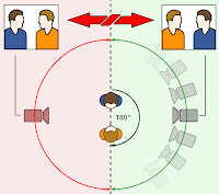
Image showing the rule and also this link to explain the rule in more detail http://www.google.co.uk/imgres?imgurl=https://blogger.googleusercontent.com/img/b/R29vZ2xl/AVvXsEiJBE6QwYRsmBRmuKYgC-PVY3Pi_t8oUxcR-okKtTOJA3Rjt6J637YK52TXNIixLS4GBgRnUNTCBYHuQeWTH8qI2L-_wr0OuxItLZ-258w-w_HwPQN0KVBRBPHaNZ_Xrc4YlMRXIU9eZB0n/s1600/678px-180_degree_rule.svg.png&imgrefurl=http://thescripturesofch.blogspot.com/2011/03/180-degree-rule.html&usg=__AGDKEI716AU1XwdnOVHGaRVhKKk=&h=599&w=678&sz=82&hl=en&start=1&zoom=1&um=1&itbs=1&tbnid=uHxgXFhKvZc8_M:&tbnh=123&tbnw=139&prev=/images%3Fq%3D180%2Bdegree%2Brule%26um%3D1%26hl%3Den%26rlz%3D1T4HPEA_enGB350GB350%26tbm%3Disch&ei=kaS5TaPeCsqt8gOx2vQ1

Overall i was very pleased with our film and we worked well as a group.

Monday 25 April 2011

Opening titles and credits research - Laurel Drew

The Girl with the Dragon Tattoo
Confusion and enigma - The audience don't know what the man is looking at, or why. They also don't know who he is.
Close up of the parcel and hand drawing attention to what the character is doing.


The title is superimposed onto film - A picture of a girl, also creating confusion because we don't know who she is, but she might be the girl with the dragon tattoo.
The actor's name are superimposed onto the film.
All the credits are in capital letters and white.
They are in a simple font making them easy to read.
The title of the film and what it is based on is in the centre drawing attention to it.
The actor's names are in the bottom right corner.
They are all the same font size.
The credits fade in and out.


Enigma created because you only see the back for the character walking - hidden identity
Black/dark colours costume, almost sillhouet?
Dark lighting used - eerie, creepy. Night time.
Cuts between locations of the character walking showing time passing, and another place on the journey.
The character doesnt reach their destination within this shot, creating enigma about where they are going and why.
Sillhouetted figure walking through alley ways

The story is being established during the credits.
The non-digetic music creates suspense and tension. The music builds throughout and when he begins to cry, increasing the tension further.
Shallow depth of field is used at the end of the clip. However the character is still hidden and so their identity remains annonimous creating more engima.


Low angle of the man looking at the picture, showing importance or status within the scene.
Tracking out of the man sitting at the desk, establishing his context and the location. Showing the room is big, with a lot of things in. He is significanty small in the space - unimportant, weak?


One Hour Photo
The credits are imposed onto a black screen.
There is a combination of capital and lower case letters.
Simple font

White titles, red titles, and writing in the bottom left corner


They wipe from the left side of the screen to the centre, then beginning to wipe to the right before they fase out.
The credits start of white, there is a camera flash (relating to the title?) and they change to red.
The titles changs to many colours including white, red, purple, yellow, green etc.
The title flashes through the colours slower than the other titles, drawing more attention to it and making it stand out more.
Different sized fonts.
There is text in the bottom right hand corner of every tiles but you can't see what it says
Nothing is given away during the credits, the story is yet to be established.
Tense atmosphere because the coulour of the titles changes adding to the curiosity and enigma.
The black screen creates suspense because you don't know what's happenign next and nothing is given away.
Non-diegetic sound adds to suspence and tension.
The white camera is a contrast to the black screen previously used for the titles.
The mug shots create a sense of crime/police investigation.
They are given numbers and descriptions but not names.
Their costumes are plain and simple.
They body language and facial expressions are neutral but slightly tense.
Still shots are used before the camera adds movement like a pan or a character begins to move. This adds tension and allows the audience to take in the setting and context of the scene.
The orange chair stands out within the white room, drawing attention to it. And showing the policemans authority.


Vertigo
White titles
Block capital letters
Names are in a bigger font than with and co-starring.
Black screen with a blue swirley picture in the centre creating enigma and suspense because we dont know what this swirl is. 
They are imposed onto the black screen and blue swirl, so somewhere between a blank screen and superimposed onto a picture.
Most of the names are on the right hand side of the screen.
Other titles are in the centre.
As the sequence progresses they begin to alternate between left and right sides of the screen.
Graphic match used from the blue swirl to the eye.
The director's name is super imposed onto the eye in the centre on the screen drawing the audience's attention to it.
This sequence doesn't give anything away about the plot of the story.
The non-diagetic music builds thoughout the scene.
Block capital white lettering - blue swirl - graphic match - superimposed text.
Extreme close up used on the eye of the character.
Close up used on the man's hands as he grabs the rail.


Camera zooms out as the man climbs the ladder.


Pan shot used to establish the scene and location of the two characters.
Birds eye view used to emphase how far the man hanging onto the gutter has to fall.

A slight high angle used on the man who is hanging creating the impression we are looking down at him, and enabling us to empathise with him.

Wednesday 30 March 2011

Taking on board feedback

Originally we had planned for our opening to end with Laurel on the phone and then the story would cut to a previous time in a flashback style. However, after receiving feedback from Katherine we decided that the ending needed polishing up as it left the audience slightly unsure on what happens and looked almost un-finished. After discussion we decided a simple black screen following Laurels phone conversation would be simple and effective as an ending. We're happy with this decision and take on board all feedback given.

Opening to 'Phone Grid'


This is our finished opening sequence.

We would be grateful for your opinions about the camerawork, sound, mise en scene, lighting etc.
Thank you.

Soundtrack

We struggled to find a suiting soundtrack to accompany our piece. As the pace of the shots was naturally slow, we decided the soundtrack should be contrapuntel to the action but at a faster pace so that the entire opening seemed faster and not so dull. After much time on garageband we finally settled and the sound is now completed.

Tuesday 29 March 2011

Draft Evaluation- Emma Chamberlain


1). In what ways does your media product use, develop or challenge forms and conventions of real media products?
The hidden identity of the phone owner along with the putting the phone in a isolated setting, shown by the original establishing shot, creates confusion within the audience which is a typical convention of thriller films and allows for the audience to ask questions which results in them being more inclined to watching. The following characters allowed us to have a limited depth of characterisation and due to this lack of detail the audience is once again forced to ask questions on how the characters relate to each other, why they are all being rung by an unknown number and most importantly, why have we chosen to show this as our opening.  These questions where what we tried to achieve within our opening through the use of thriller conventions that we
have previously studied.
 
'21 grams' 3 characters


Our 3 characters, hidden faces.

Our opening was similar to ’21 grams’ (a high budget thriller film) in that there was little depth in to each character shown and therefore we struggle to understand what is happening using this restricted narration. The tittles and the sound where typical to a thriller in that the soundtrack was contrapuntal to the action and it also reflected the thrilling feel we desired in the eerie piano notes and climactic instruments.  The camera movement such as slow establishing shots, allow the audience to see the remote setting which connotes isolation and fear within the audience which is a typical convention of a thriller film and is used in many other thrillers to allow the audience to understand the setting such as Donnie Darko where we see a long shot which stretches longer than most first cuts allowing the audience to really notice the setting.


Donnie Darko-Establishing shot

Establishing shot


Other long shots of the characters and framing shots through a window for example, create a sense of hidden point of view and the characters being watched.

Through the window shot in the programe 'Wallander'

Through the window shot in our product


 This is a typical thriller convention and is seen in programmes such as wallander which is a famous thriller programme. Another way we used forms of a thriller film is in our sound effects that where added using mainly garage band. The alarm clock noise was sharp and violent which came as a shock during the calm and flowing feel created previously by wipe cuts but disrupted by this sound effect. This shock effect makes the audience slightly worried and aware something possibly dangerous and frightening could be about to happen. The sound effects where louder than the soundtrack and where used mainly to keep the audience on edge as well as to enhance the naturalistic feel to our media product.


2). How does your media product represent particular social groups?
Our product represents gender traditionally, such as the male character is shown coming out of the gym to represent the typical stereotype of men being strong and hard. In comparison to this the women are shown to be in typical female situations such as in the kitchen cooking, reflecting the stereotype of women are housewives, and in the bedroom brushing hair to show how women traditionally care about their appearance more than anything else. 
Our representations of gender in the final product
 This representations are traditional for gender. The costume chosen represents gender traditionally also- the man wearing a blue top and the women wearing pink trousers. Props such as the ring on one of the females fingers and the surrounding hair and beauty products for the other female also represent a typical gender stenotype, women are more concerned with their appearance compared to the man who is walking but has no bag or accessories, to show that men care less about these things.  However, the sound focusing mainly on the phone ringtones is not traditional to gender stereotypes. Both male and female have standard ringtones that do not connote any gender stereotypes, this breaks the traditional representations of gender. Another way in which we broke the traditional gender representations is that the male character is leaving a gym. Typically males are not assumed to care about their appearance but here we show a man who clearly does and therefore we go against any traditional stereotypes.


What kind of media institution might you distribute your media product and why?
When discussing the media product and it’s target audience as a group we came to the conclusion that the best institution for our production is Diffusion, followed by BBC short films to distribute our product. This distribution company focuses on short films from british filmmakers. Our piece fits this description and also the short film category prevents the need for us to stretch the film out any longer  than necessary. BBC short films is open to everybody with internet access, which slightly restricts our audience however it has already hosted many short thriller films such as ‘playground’ a 9 minute long thriller made by a university student.

http://www.bbc.co.uk/filmnetwork/films/p00fwg9h


This is a similar film to ours and as it has had such good feedback from the BBC short films website, it ensures that our product would be suitable for this website also.  In turn we wish to get our product aired on television such as BBC3 to widen the audience, (you can see on the link the audience is mainly '16-34 year olds focusing on new talent') BBC3 is a good channel as it’s not prime TV and wouldn’t be attracting an audience of too larger scale however it would still publicise our product better than any internet page could as more people watch TV. The bonus’s of airing our piece originally on the internet is that the distribution costs will be considerably less, It would be suitable for our chosen target audience though because we are aware that 15-21 year olds would have internet access and are more likely to watch films using the internet than an older generation therefore we will hopefully get positive audience feedback.  Being on the internet however relies on word of mouth, our audience will most likely watch our piece because it has been recommended rather than accidently, which is a possibility for TV audience. Due to this we are aware the audience will be considerably less but the costs saved from our choice of distribution will make up for this. By distributing our piece online we will stop any confusion, the audience are ‘getting what they pay for’ rather than if we tried to air our product at the ODEON cinema where the audience will have higher expectations that will fail and therefore we will receive negative feedback. Another choice we made as a group is to release our film on a Wednesday as the competition for new films is less- it’s an ‘off-peak’ time for releasing new films. This will hopefully boost our views and achieve good feedback and recognition.  


Who is the audience for your media product?
We chose to target our media product at 15-21 year old males and females from a modern British lifestyle. We decided it would be suitable to certificate our product as a 15 which according to the BBFC allows for: ‘Strong threat and menace are permitted unless sadistic or sexualised.’ In the storyline of our film it creates a thrilling aspect to it and although the horror within our storyline isn’t to the point where it would create anxiety within the audience it is enough to be exciting which will also attract our older audience members such as 21 year olds. We also use Imitable behaviour is also used, this also allows for an exciting drama feel to our product which keeps the audience entertained as well as attracting the older end of our audience. We decided to change our original idea for an 18 certified film as we used younger actors that will attract a younger audience such as 15 year olds, this allows us to still have a thrilling and exciting feel whilst able to attract an audience as young as 15.


How did you attract/address your audience?
We where able to attract our target audience using different affects that created a thrilling feel that teens desire such as an unknowing protagonist, slow and long pan shots that create a build-up feel. These things combined with the eerie soundtrack and loud sound effects all create a thrilling feel which our target audience of 15-21 year olds desire. The actors and characters we used in our product will reflect our target audience and also allow for them to feel empathy with the characters. This relationship between the characters and the target audience will help to build the audience’s emotions towards the characters and therefore feel empathy towards them when drama effects them within the story. All these factors allow us to address our audience correctly whilst also conforming to the thriller conventions that have previously been mentioned. The minor violence, dangerous behaviour and horror styled action can help attract not only the younger range of the audience (15-17 year olds) who desire the action and thrill that they would not get from a film that is certificated below a 15, but the older and more sophisticated audience will also be attracted to our film despite its 15 certification and the limitations that come along with that. The older audience will still be attracted by this and we know that because they can still enjoy our complex storyline with features such as a hidden identity and the restricted narrative.


What have you learned about technologies from the process of constructing this process?
·        Learnt to set white balance and why its important,
·        How to shorten the clips to cut out any ‘waste footage’
·        Add sound to an already finished movie
·        Use garageband to add sfx that are vital to create a realistic film
·        180 degree rule etc
·        Mirrors when filming, avoid getting the camera in the shot.
·        Using the tripod to create stiller filming, avoiding the handheld effect that is only good for specific shots.
·        Zooming in to avoid moving the camera, better quality. Used this a lot
·        Pace is created not only with the length of shots, establishing shot at the beginning of our scene, but the music. Without our music


Looking back at your prelim task, what do you feel you've learned in the progression from it to the full product?
Our prelim task was constructed using basic apple software that restricted us from editing to a higher standard and including effects that can only be found on software such as ‘imovie’ and ‘final cut’. After filming our final product we decided to get the best results we would need to use more advanced software to get the best results and so, we used ‘imovie’ and ‘final cut’. I feel in the process of using these editing software’s I have learnt how to use effects that before weren’t possible and use different transitions such as wipes as well as recognising when each transition was suitable to make the product fully effective in creating a thriller feel. Not only did we learn to use better editing software but the camera itself was a better standard. This new HD camera had different controls for the filming as well as using different memory storage- a tape was no longer in use. Because of  these differences I feel I have learnt to adapt to different software that will suit our product best, changing the technology in order to achieve the best results as we learnt from using the standard software and technology in our prelim task didn’t achieve the high level of quality that we wished for. Location was another big change from our prelim task as we where allowed to film off site and in any location that we thought was best suited for our thriller opening. Due to this we where able to have a selection of interesting settings that reflected our characters to help the audience see characterisation and feel empathy for them. Props, costume and all other areas of mise en scene where discussed and prepared thoroughly before filming. The pre-planning techniques used within our final product compared to our prelim where vital in getting the results we wanted. Each person in our group needed to have a particular role and needed to be prepared to bring to each set, the vital equipment. I took the role of props and sound and was in charge of the phones and radio predominately. After the prelim task I think I became more aware of how important it is to plan affectively and be prepared to have all props ready for the filming before hand. The storyboarding stage was also different in our final product as we found in the prelim task that drawing on paper was not clear, hard to change when we needed to adjust shots and ended in confusion. In our final product we decided to use post it notes for each camera shot which allowed us to make changes where needed. We also introduced the use of animatic to show our storyboard in a more creative way that we could also compare our final footage to so that we could see changes we made along the way. This was never used before and so it was a new and useful technique used compared to the prelim task. Part of my role in the group was to focus on the sound of the product, in doing so I learnt effectively how to use garageband to create sound effects, cut the sound to fit the action and put the sound and the action together to create a final product. In the prelim task I didn’t have any experience with garageband.

Monday 28 March 2011

Titles and Credits - Jamie Parrett

No Country for Old Men


The placement of the company names and the flim itself was in the centre of the shot with white writing on a black screen making the titles stand out. I personally didn't like the way they did that because it was normal and boring, i wanted my group try something different. The music used in the piece builds tension throughout the sequence, but it stops when it gets to the climax of the beginning where the arrested man sneaks up on the policeman and starts choking him to death. I like the way that there is no sound when the titles are shown, this is used to make the audience concentrate on the credits and not the sound being used. The graphics are in bold font so they're easy to see and read, as well as all the letters are in upper case, maybe to create a sense of urgency showing that the character in the film lives a dangerous lifestyle. I like the use of fonts to bring out the personality of the character without the viewer having to wait and watch the start of the film, they can start questioning his job and hobbies. The mood throughout the opening is a bit tense until the arrested man starts choking the man death, everything suddenly turns more upbeat, near death experience tyoe music starts playing until he stops struggling, then the music stops completely. I especially like the way which the music is used to make the man struggling seem over dramatic and then suddenly cut dead to make the viewer shocked.


Misery


The placement of the name of the film and the logos of the companies on a black screen in the centre of the shot to make the writing easier to see/stand out. The actors names are also always in the centre line of the shot, making the audience look and read them. I personally feel that the way they displayed there credits was dull and boring and it seems like they put no effort into them, and its quite repetitve with them in the centre of the shot everytime. The music used is contraputal showing that the character has a fun side as well as a serious side to his personality. In the beginning of the title sequence, it only uses natural digetic sound to show the character concentrating on something which seems important. I like the use of music as it shows the audience that the character does have more than one side to him, maybe helping the audience to side with the character early on in the film. The graphics used in the titles is effective as the red of the writing and the boldness makes the title stand out from the background. All the letters of the title are in upper case showing the audience that there is a sense of urgency about what the character is doing. I don't like the colour used in the title as the red connotes blood and death, this may put off the viewer and make them not want to watch it. The mood of the tilte sequence is one of concentration while he is typing his book but once the contraputal music kicks in, then the mood changes to happiness showing the character is glad to have finally finished typing his book up, but once the car crashes, the mood changes to shock and disbelief. I like the way the opening title sequence changes all the time to keep the audience guessing to what kind of film its going to be. I thought that my group could use something like this for our title sequence but in the end we decided on somehting else.


Seven


The placement is not always in the centre of the screen, making the viewer look around the screen to read the names, drawing their attention to make them notice the next object is. The titles are sometimes placed where it was difficult to read, maybe trying to put people off. I like the use of titling to draw people's attention to the point of interest. I wanted to use that idea in our thriller film but it wouldn't have worked. The music used is very off putting, as it builds tension throughout the sequence. The music also confuses people watching it to what is actually going to happen. While the music is doing this, it adds to the confusion made by the objects being shown throughout the sequence as to why they might be showing them. I like the confusion this makes as it makes the audience automatically ask questions about the film without the setting having to be seen. The graphics used is very off putting as the font changes as well as the type of lettering used as it changes from lower to upper case, again adding to the confusion of the title sequence. Bold font and white text on black screen makes the titles stand out very well. I like this idea alot and as a matter of fact, we even used white bold font and titling in our thriller opening, this looked really good and was easily seen. The mood of the tilte sequence throughout is always tense and building the confusion by making the audience ask lots of question about the polt and outcome of the film and how all the objects in the tilte sequence relate to the film in any way at all. I like this idea as it would make ask questions about it all but to use it in our thriller would be highly inpractical as it would take up too much time and therefore wouldn't be able to fit our own footage into the opening.